Over the last couple of weeks I’ve done some more work on the in game UI.
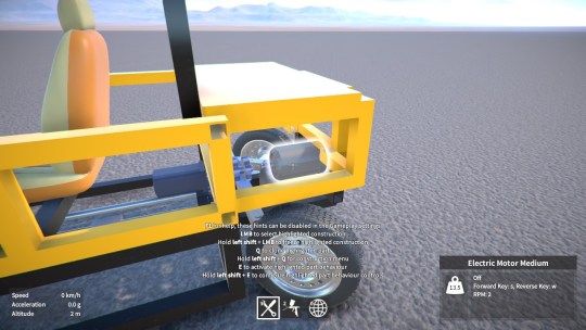
I’ve removed the old text overlay that showed the name of the highlighted part, as it was positioned near the cursor and kind of in the way. Now I have a new overlay in the bottom right corner that shows not only the part name, but other details such as its mass, whether it’s paintable or resizable, and info on its behaviour status.

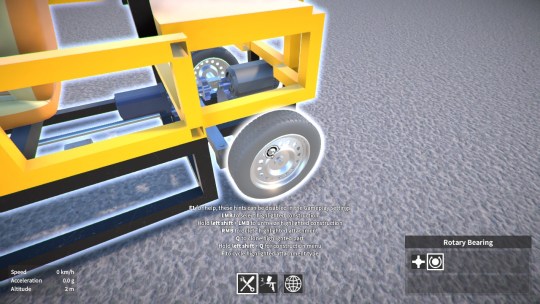
I’ve also added a similar overlay for when you’re hovering over an attachment in a frozen construction. It displays the available attachment types that you can cycle between (highlighting the current attachment type), and it’ll also show info on other things like attachment integrity (if damage is enabled).

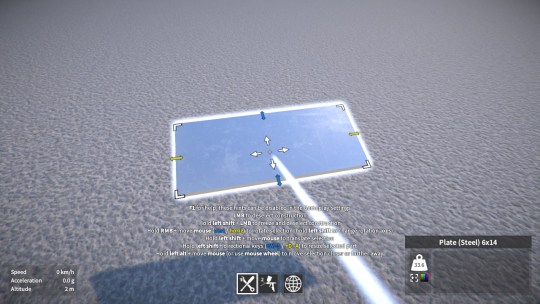
During part resizing, rather than add yet another UI display to show which keys to use
to resize in each direction
(as I was originally thinking), I decided instead to just colour code the relevant parts of the hints text.

Finally, to help the new UI elements fit, and clean up the look of the UI generally, I’ve also made the whole thing scale based on the screen dimensions. This means that (in full-screen mode), the UI elements appear the same size regardless of the screen resolution. I think this is a big improvement, especially at lower screen resolutions.
